Visual drivel defended by marketing & creative drivel
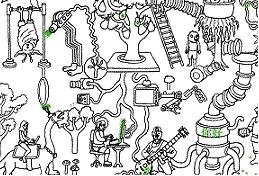 Ok, help me out here. MSN and agency AKQA launched a new interactive campaign for MSN messenger called "The Way News Spreads".
What is it you ask? A single web page with animated doodles and a single link to MSN. Check out the page here.
I don't get it. To try to find some insight, I re-read the Clickz article about the campaign.
The agency's creative director describes it thusly:
He said the illustration's central theme is interconnectedness, which is the value proposition of instant messaging. He pointed out there are no loose ends on the site.
"There's a snake that jumps into a hole and jumps out of another hole in another place on the page," he said. "We didn't want to picture Messenger as the main part of the story. Messenger is just a way to talk to your friends, exchange ideas, share some thoughts. We wanted to explore, in a visual metaphor, how many ways you can [do that], and how that comes back to you." ...
The site is designed to reward those who look closely. Extremely observant visitors may even notice tiny messages written in Braille and Chinese characters hidden on the page in plain site.
Are you kidding me? This is a joke right? My favorite piece of drivel is the "We didn't want to picture Messenger as the main part of the story". Story? What story?! There is no story here.
Do they honestly think that in the ADD interactive world, someone (other than your ass-kissing jr. copywriter) is going to actually take the time to try to figure this out? No, no one is going to do that. I may buy it if you framed this as an art project but it's so obviously a campaign (banner ads will drive to the page).
Interactive consumers are impatient and a little stupid; trust me on this one, I've stared at reams of data that prove this. They like usability. They need a little hand-holding, because frankly, they don't have time to indulge in your esoteric creative ego-stroking. In my experience, if you don't provide a little guidance and some real story-telling (not the kind that starts with "once upon a time", but at least point to a place to start), users leave within 3 seconds. Three seconds! And that's only because it takes them 2 seconds to find an exit route.
This page is an unnecessary click between consumer and product. It would have been better for MSN's ad units to jump directly to a download page.
Please someone tell me that I'm flat wrong, being unfair, not "getting it" or a pompous arrogant jerk because if I'm right, it's just depressing.


No comments:
Post a Comment