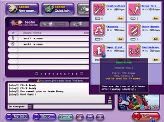
Does this font make me look fat?
 We're really close to finishing up BOTS. So close I could taste it... but there are still tons of things to finish and decide, like choosing a font. Among all the decisions we have to make, you would think a font would be one of the easiest right? Nope.
Fonts are one of those things that are frequently overlooked but can cause disaster when the wrong fonts are used.
An Amazon search on "font book" yields 281 results. Let's not even talk about Googling "font". There is just an amazing volume of work dedicated to fonts. The art/science behind fonts is known as typography. It has it's own language too with words like:
- Serif (letters with hooks at each extreme, Times Roman is serif)
- San-serif (no hooks, Tahoma is san-serif)
- Ascenders & Descenders (the top of an "h" and the bottom of a "g")
- Pica (like size points, check out typographic units)
Check out some finalist, click to see them.I'm leaning towards #1. Unless I hear an uproar from you guys, that's probably our final choice.

No comments:
Post a Comment