Judging video game online ads, Idol style
So I intended to get all Simon on these ads but then, I chickened out. Paula... nah. So we're left with....
Look dawg, ads are tough. You got to sell but not sell out. Ok, I'm feeling ya, I'm feeling ya. Let's see what you got.
(hehe, enough with that)
I apologize for not being able to show you the actual ads, the best I can do is screen grabs. But if you surf around game sites now, you'll run into these.
Not Going to Hollywood
D&D Online - What exactly are they trying to sell here? The medallion right? Right.
Sour Notes - No info about the game. Logo overload. No copy whatsoever. Excessive use of... medallion.
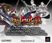
High Notes - Clean layout Onimusha - Paula likes this one, but that's not enough.
Sour Notes - A little busy, could use one or two less characters. Too much copy.
High Notes - Good use of color to make name pop.
Elder Scrolls IV - This ad cycles through about 3 reviews then falls flat.
Sour Notes - Logo overload again, why do we need to see everyone's logo? Way too much copy to read, no one will stick around for that.
High Notes - Prominent game title on top.
You're Going to Hollywood Dawg!

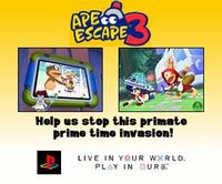
Ape Escape 3 - I love monkeys! This ad gets it done.
Sour Notes - I would have loved to see a call to action, like "Click here to find out more"
High Notes - Great attention grabbing intro screens (3 cute monkeys, see, hear, say no evil). Payoff screen shows game footage. Final copy talks about game story. Single PS logo. Game title on top. Art direction and colors pop.

Wendy's Spicy Chicken Sandwich - When I first saw this ad, I said, "Uh duh, of course! How do you know me so well?!" (This is not a game ad but an ad towards gamers, so sue me.)
Sour Notes - What exactly are you trying to sell me? I would have clicked if I had more info.
High Notes - This ad shows that you don't need cool images to grab attention. The art direction, colors and movement was enough to capture the eye. The copy did the rest. Auto Assault - This ad was a full video with copy overlays and a nerve wracking countdown timer on the bottom.
Sour Notes - Not much, I would have liked to see longer scenes rather than jerky clips.
High Notes - Video works for me. The best part of this ad is the countdown timer. Lets me know the game is in beta, that there's a final event, and that it's about to end soon (which means the game is released soon). Brilliant. Game title is prominent through the whole thing.
I actually don't have anything to say about these but I thought I'd butch up the blog a bit.


In summary:
- We really don't need to see the logo of every company that has touched the game, just show me the game title and the publisher.
- Keep it simple and use a clean device to grab my attention.
- If you're going to show me a lot of visuals, at least show me something about the game.
- Tell me what to do next, should I click, buy the game, or what?

No comments:
Post a Comment